Dashboards
How to build customized dashboards inside the Restaurantology Chrome extension.
Updated over a week ago
Restaurantology allows Chrome extension users to create customized dashboards to visualize TAM and technographic insights through interactive charts and lists.
Accessing the Dashboard
Dashboards are available inside the App Center, which provides quick-lists and widgets to help you navigate the dataset more efficiently.
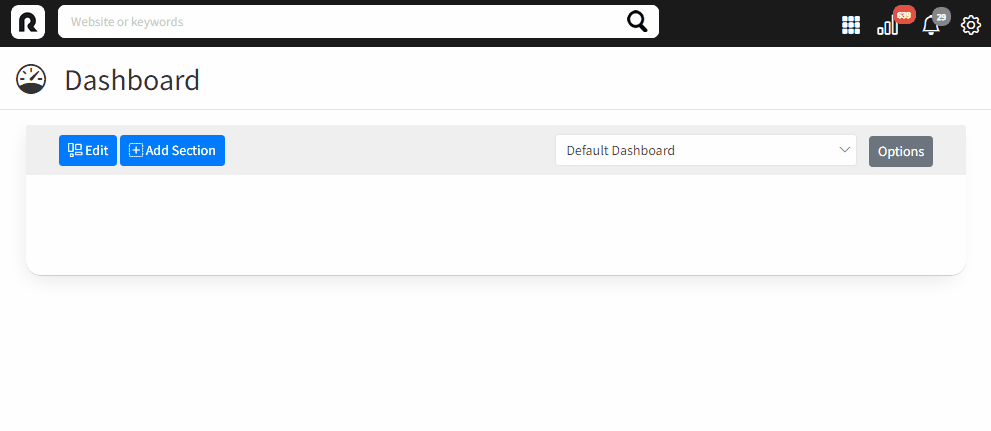
To access Dashboards:
- Click the grid icon (nine dots) in the sidebar toolbar.
- Select Dashboard from the menu.
Building a Dashboard
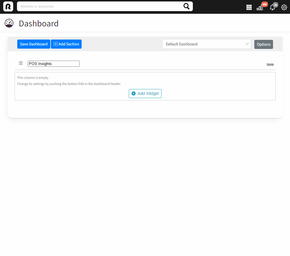
To create your Dashboard:
- Click Edit.
- Click Add Section.
- Enter a Title for your section.
- Choose a layout (1 to 3 columns).
- Click Insert.
After creating a section, you can begin adding widgets:
- Click Add Widget.
- Choose a Widget Title.
- Choose a Widget Type:
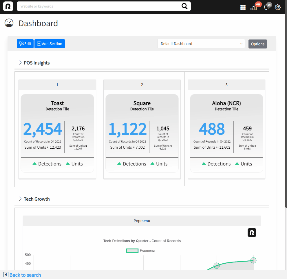
- Lists: Excel-style summaries of selected Concepts or Companies.
- Tiles: Visual profile tiles for Concepts or Companies.
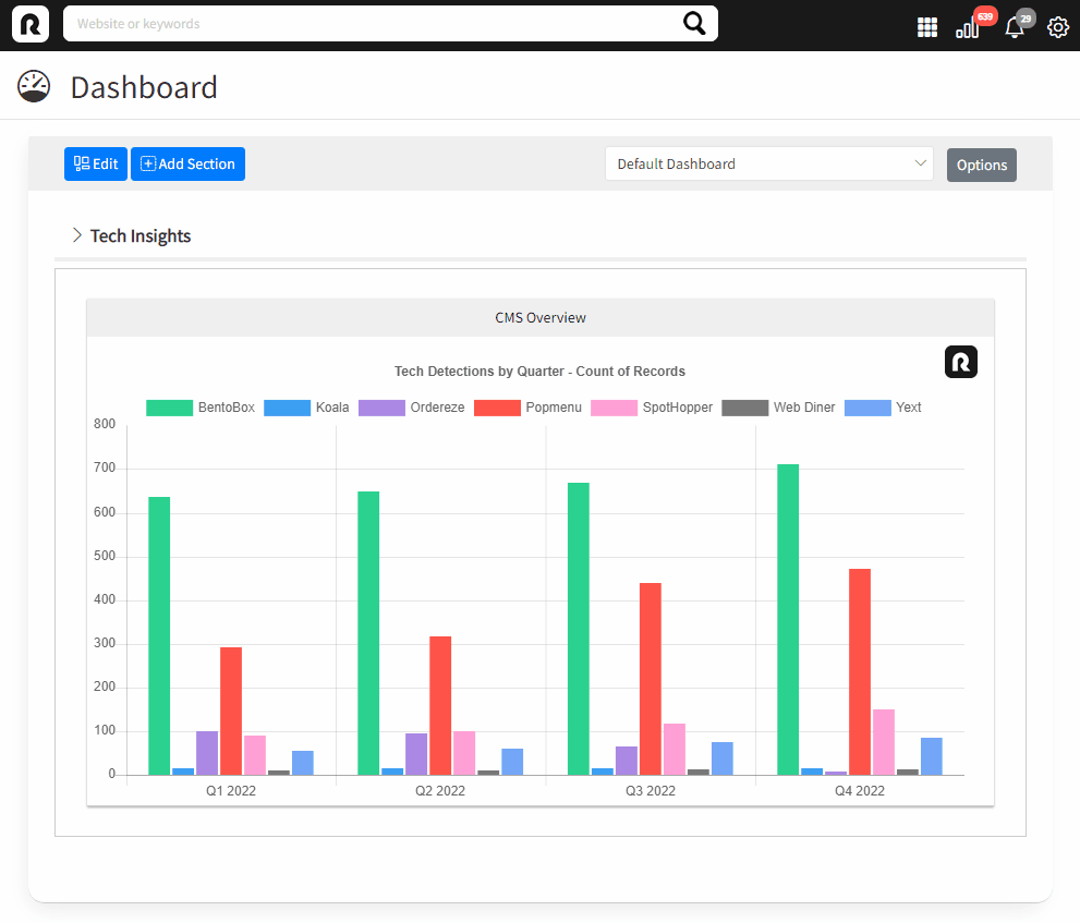
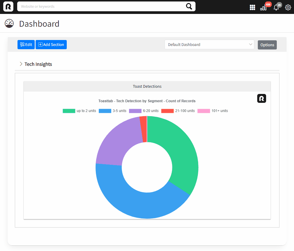
- Tech Monitors: Charts and graphs showing technology adoption across the industry.
- Inside the widget, click Settings.
- Select one or more Concepts or Companies to insert.
- Click Apply.
Dashboard tips and tricks
Reorganizing dashboard components
Sections and widgets can be rearranged using drag-and-drop. Click and drag using the reposition icons.
Toggle detection count vs. unit sum
Tech Monitor charts can display either:
- The number of detections (websites) or
- The total unit counts associated with those detections.
Adjust this setting inside each widget’s Settings menu.
Show or hide chart elements
Bar and doughnut charts allow you to hide or visualize individual data elements dynamically after rendering.